iOS 7 – First Thoughts and Tips
My first impression of iOS 7 (I had it a while back since I’m a developer but it was under NDA) was not the best – it was change and some things worked differently though I mostly liked the look (still don’t like the Safari icon).
But I quickly grew to like most things… mostly the look. I like the way folders organize now and the parallaxing background is cool.
I don’t like the way the screen fades in when unlocking – too slow when I just want to check the time. Same for when you unlock the phone, the icons flying in is delay I don’t want or need.
Opening an app is cool the way it opens visually from the icon and retreats back the same way.
Here’s an interesting article about changing some of the new settings and such.
Tips
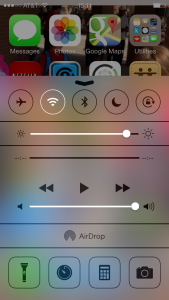
The Control Center (see image left) opens from a swipe up from off screen at the bottom. It is great: quick access to key features. Try to swipe a bit to the right when the screen is locked or you’ll get the camera.
The Notification Center is a bit different – the weather is a bit chatty, but I like the calendar part (and if you have an upcoming event in the calendar w/ a location, it will estimate the drive time). Also the All and Missed parts are good. Notice the AirDrop section in there – see below.
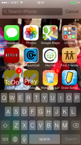
 To access Spot Light, (see image right) instead of double tapping the home button or swiping left past the first home screen, just swipe down on a home screen from anywhere NOT at the edge. I like that more.
To delete items in a table/list like email, swipe right-to-left.
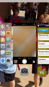
 For Multi-Tasking, (see image left) it’s still double-tap the Home button, but it will look very different. The main thing to learn is you swipe an app up to remove it from execution/memory.
In Safari, there’s just one bar for URLs and searching. Also, for Back and Forward you can just swipe right and left (respectively) from off the left/right side of the screen. That took me a while to get used to.
I’m very excited about AirDrop – being able to share/send things to people around me
Apps automatically update (if configured) so no more AppStore icon with a badge number of “32” to update.
The Camera has some new modes – mostly square and some effects. Also the Photo Album has some cool new ways to organize images/videos.
I haven’t messed w/ iTunes Radio so I can’t say about that.
Using the Settings app you can set/configure things as before so I always recommend going thru that and seeing what’s new/different to set.
Like many things, at first I was leery but then liked it. I’m seeing some posts and such of people not really digging it, but I have a feeling they will after a while.
Any particular discoveries, likes, dislikes, etc. you’ve found?


